?>

A (Detailed) Look at the 4-Color Theorem

A proof that went undone for 80 years – we’ll go from maps, to planar graphs, to Kempe chains, to the final computer assisted solution.

2-Coloring Doodles

I was playing around with MS Paint recently and I ended up with a drawing that will probably look familiar to anyone who has ever idly messed around with MS Paint.

In addition to the nostalgia of remembering digital doodles from elementary school, I had another thought about this drawing. I wondered if it could always be colored with 2 colors “correctly” – such that colors only touched at corners (like a checkerboard). When I colored the drawings in using the Fill tool, the correct coloring naturally falls into place, but it is not entirely clear that should always happen. I could imagine a situation where it becomes unavoidable to color two adjacent regions with the same color (or to add a third color).

In fact, you will always be able to correctly color a pattern like this with 2 colors, and we can show it with a very simple inductive proof. We will induct on the number of lines in our pattern. If there is only one line splitting the plane, we (of course) can color the pattern by simply making one side black and one side white. So the “base case” works.

Now suppose we have a pattern made up of n lines and we have successfully 2-colored it. When we add another line, we can split the plane into 2 regions based on this line and arbitrarily designate one to be red and the other to be green. Leave the green region colored as it is, and invert the coloring in the red region (make black regions white and white regions black). Now along the new line no adjacent regions will have the same color, because one side’s coloring was inverted.

So we generated a successful 2-coloring for n+1 lines from a coloring for n lines. Therefore (by induction), we can 2-color a pattern made up of any integer number of lines splitting the plane.

With a little work (try it!), we can generalize this result to patterns made up of closed shapes, curved lines, and lines that overlap themselves, like those shown below.

The condition on 2-colorable “doodles” is that the lines can only overlap at single points. This means that no two lines can share a segment of non-zero length. In addition, only two lines can intersect at any single point.

Moving onto Maps

Of course, the logical next question is: what if we made drawings (like those in coloring books) that did allow lines to have overlapping segments? How many colors would we need to color such a pattern “correctly” a.k.a. such that no two adjacent regions have the same color? We will call these patterns “maps” because cartographers usually try to preserve this property to prevent confusion between neighboring countries, states, provinces, or regions.


A map of the United Stated colored with 7 colors. No adjacent states share a color. In this map, countries that touch at a corner also don’t share a color, but this is not a constraint for our purposes.
Source: Washington Post
A map that immediately requires 4 colors

By drawing a couple pictures, we can see that at minimum, we need 4 colors. This is because we can draw a map with 4 regions such that every region shares a side with all 3 of the others. This map clearly requires 4 colors. However, I was not able to draw a map with 5 regions such that every region shared a side with all 4 others.

But this by itself does not imply that all maps can be colored with 4 colors. It is easy to imagine a more intricate map where not being able to use the same color in two adjacent regions would eventually force a fifth or even sixth color.

If we 4 color the map on the left, and then add the encircling region, the map now requires 5 colors (as shown on the right). We can recolor the map on the right using 4 colors, but it is nontrivial to show that is always possible.

Maps → Graphs

This problem can be simplified somewhat by taking maps, which contain weird shapes of varying sizes, and translating them into “graphs” which only contain nodes and connecting edges. Every region will get a node, and if two regions share a side, then their nodes will be connected with an edge. This removes a lot of the complexity of the individual shapes involved in the maps, but preserves all the information we need to color them (because, based on the edges, we know which nodes cannot be the same color).

Translating two maps that initially appear distinct into the same graph. This means that if one map can be 4-colored, so can the other. Notice that Graph 2 appears non-planar at first (lines cross) but since it can be “untangled” it is actually a planar graph.

All possible maps will lead to “planar” graphs, meaning that they can be drawn without the lines crossing (curved lines are allowed). Non-planar configurations do not correspond to valid maps, which makes a kind of sense if you consider the edges in a configuration to be analogous to regions.

Proof of the 6-Color theorem

Since the 4-color theorem is rather difficult to prove, let us start with the substantially easier (and weaker) 6-color theorem: no map requires more than 6 colors to ensure that no two adjacent regions have the same color.

We can apply theorems about planar graphs in order to prove the 6-colorability of all maps. One theorem is that every planar graph with v \geq 3 vertices and e edges, e \leq  3v - 6 (for a proof, see the Testing for Planarity section on this page). We can use this to prove that every planar configuration will have at least one vertex that connects to \leq 5 edges.

At least one of the vertices in any planar graph will look like one of the above vertices (shown in red). In other words, at least one vertex in a planar graph has less than or equal to 5 edges connected to it.

We will use proof by contradiction, so assume that every vertex in a graph connects to \geq 6 edges. Every edge connects to exactly 2 vertices, so e \geq \frac{6}{2}v. From the theorem above we know e \leq  3v - 6, so therefore 3v \leq  3v - 6 which is an obvious contradiction.

We can use proof by contradiction again to prove the 6-color theorem. Imagine there are some graphs that are not 6-colorable. If this is true, then there must be some minimal graph that is not 6-colorable. This graph – called a minimal criminal for “breaking the law” of 6-colorability – has the property that removing any edge will render it 6-colorable.

Suppose that this minimal criminal has a vertex A connected to 5 or fewer edges (it must, as we proved above). Let’s remove A and the edges connecting to it from our map entirely. The remaining graph has fewer edges than our minimal criminal, and therefore must be 6-colorable. So let us 6-color it. Now when we add A back into our map, there has to be a color (out of the six we are using) that is leftover, since A only connects to a maximum of 5 other countries. So we color A that leftover color and now our supposed “minimal criminal” is 6-colored. So no minimal criminal can exist and all graphs are 6-colorable.

Any “minimal criminal” planar graph requiring 7 colors can be recolored with 6 colors using this method. Therefore, any planar graph can be colored using 6 colors (you will never need 7 or more).

Attempting to Prove the 4-Color Theorem: A Proof of the 5-Color Theorem

The first attempted proof of the 4-color theorem appeared in 1879 by Alfred Kempe. The proof was similar to our proof of the 6-color theorem, but the cases where the node that was removed had 4 or 5 vertices had to be examined in more detail. Kempe came up with a method that involved exchanging sequences of alternating colors called Kempe chains. In order, to give you a better understanding of Kempe chains, I will explain how they can be used to prove the 5-color theorem.

From our proof of the 6-color theorem, we can realize that the only case that does not directly generalize to 5-colors is the case where the vertex we remove has 5 edges and connects to 5 differently colored vertices (since there will be no leftover color to use on the central vertex). So consider a vertex connected to 5 other vertices each with a distinct color. The method of Kempe chains (illustrated below) then allows for the 5 nodes surrounding our vertex to be colored with 4 colors, leaving the fifth for the central vertex.

Recoloring a subgraph using the method of Kempe chains. The colors may not be in this order, but the basic idea is always the same.

Kempe cleverly used the method of Kempe chains to prove the 4-color theorem – or so he and the mathematical community thought. The proof appeared valid for 11 years until Percy John Heawood published a paper pointing out that in a particular subcase, Kempe’s method will not yield a 4-coloring (see here for more detail). Kempe tried to revise his proof, but was unable to do so. Note: The proof of the 5-color theorem using Kempe chains that we showed above is still valid.

Appel and Hakken’s Computer Assisted Proof

After Heawood refuted Kempe’s proof, mathematicians continued to try to prove (or disprove!) the 4-color theorem for over 80 years. Finally, in 1976, Kenneth Appel and Wolfgang Hakken published a paper called “Every Planar Map is Four Colorable”. Their eventual successful method ended up being similar to the proofs we discussed for the 6-color theorem and the 5-color theorem, only substantially more complicated.

The idea of the proof is to first come up with a set of configurations (which are subgraphs) such that every planar graph must contain at least one. This is called an unavoidable set. Then, it must be proved that every configuration in the set is reducible. This means that we can remove it from the larger graph, recolor the surrounding nodes with only 4 colors, and then reinsert the configuration colored with only 4 colors as well.

While this sounds complex due to the terminology, this is exactly what we did for the proof of the 5 and 6-color theorems. Our unavoidable set of configurations contained a single vertex with 1, 2, 3, 4, and 5 connecting edges.

Unavoidable set of configurations used in the proof of the 5 and 6-color theorems

Then we showed that each of these 5 configurations was reducible if we had 6-colors (just using common sense) or if we had 5-colors (using the method of Kempe chains). This proved there could be no minimal counterexample to the theorems, and therefore that the theorems were true.

Now the question becomes, how did Appel and Hakken come up with an unavoidable set of configurations where every element was reducible? They used something called the method of discharging. This involves treating a planar graph as an electrical network with charge assigned to the vertices such that the charges sum to a small positive value. Then the charges are redistributed in the graph via a set of discharging rules, which preserve the sum of the charges. The discharging rules are designed so that only certain subgraphs can “hold” positive charge. Since the charge is conserved, these subgraphs form a set of unavoidable configurations for the graph as a whole.

Appel and Hakken used a significant amount of trial and error to come up with discharging rules that resulted in a completely reducible set of unavoidable configurations. They prioritized having the unavoidable configurations be small, with a maximum ring size (the number of nodes in the boundary of the configuration) of 14. Their eventual discharging algorithm was simple enough to be implemented by hand (but still had 300+ rules) and yielded a set of 1,936 unavoidable configurations.

Each of these 1,936 unavoidable configurations had to be individually checked by a computer for reducibility. This took over 1,000 hours of computer time. And then, the 4-color theorem had finally been proven.

Appel and Hakken’s proof was the subject of some controversy because its extensive use of computational strength meant that it was not human-verifiable. Mathematicians worried that there could be some error in the software used to check for reducibility, which would render the proof invalid. Even the “human-verifiable” piece of the proof (the discharging procedure) was extremely complicated (400 pages of calculations!) and therefore impractical to actually check in its entirety. However, other software was later used to confirm the complete reducibility of the unavoidable set generated by Appel and Hakken. Smaller completely reducible unavoidable sets (as small as 633 configurations) have also been generated and checked. So the 4-color theorem has been proven beyond a doubt.

Some of the configurations in the unavoidable set of 633 found by Robertson, N. et al.

Still, a level of dissatisfaction about the 4-color theorem remains in the mathematical community. There is lingering doubt that what Appel and Hakken did constitutes a “real” proof, since no human could ever completely understand every computation involved (there simply isn’t enough time in a single person’s life). Part of the problem is that the proof is rather ugly to the human eye: nearly 2,000 cases that have to be each checked individually?! The proofs of mathematical theorems are so often beautiful places of insight. By comparison, the complicated piece of calculation that is Appel and Hakken’s proof appears woefully inelegant.

However, there is something compelling about the fact that this simply-stated theorem remains unprovable without computer aid. Perhaps it suggests that we are reaching a point in mathematics where the complexity of our theorems and conjectures exceeds our personal computational abilities. And isn’t it exciting that we now have the tools (amazingly powerful computers) to take that next step? Computer assisted proofs are here to stay – examples include sphere packing, optimal Rubik’s cube solving, and coloring the Pythagorean triples – and our understanding of what a “proof” is will likely expand to accomodate.

Puzzles 🙂

It can be a rather fun time to try to “disprove” the 4-color theorem on your own by drawing some maps that are difficult to 4-color. People on StackExchange (1, 2, 3) thought the following maps were counterexamples to the 4-color theorem, can you color them successfully? (Note: You can copy the images into MS Paint and use the Fill Tool to color)

If those weren’t enough of a challenge, try 4-coloring this puzzle. (Disclaimer: It took me 4 tries before I could do it)

Martin Gardner published this image as a “disproof” of the 4-Color Theorem in an April 1st edition of Scientific American (1975). William McGregor, the graph theorist who created the map, gave Gardner permission to use it in his little prank. Solution.

If you enjoy doing these kinds of puzzles (I certainly did) then check out the FourColor app (for iOS) which has a dozen or so more.

You might wonder if there is a general algorithm for 4-coloring a map, especially given the difficulty in proving that such a coloring even exists. Surprisingly there is, and it is even quadratic (a.k.a. pretty decent) in time-complexity! However, if you are given a planar graph, it is NP-complete to decide whether it is 3-colorable (not doable in polynomial time).

It seems appropriate that we can now use computer algorithms to 4-color maps, given that the (somewhat controversial) proof of their 4-colorability relies on the brute computing power of the modern era.

Putting #1 First – Deriving Benford’s Law

Looking at when this elusive “first-digit law” does (and doesn’t) apply.

A Motivating Game

Let’s play a game. I’m going to think of an integer, and now you have to guess the first digit. Is there any way you can do better than randomly choosing a digit 1-9? For psychological reasons, my number is probably going to start with 7 (it is my favorite digit), but let’s suppose I was choosing purely randomly.

For a hint, you might ask what is the range of integers that I’m choosing from. If I’m only choosing from the range 500 to 600, for example, your best option is a lot clearer. But all I’m willing to tell you is that I am choosing from 0 to n (exclusive), where n > 1. Quickly, you could figure out that if n is a power of 10 (i.e. 10, 100, or 1,000), then you can’t do any better than random guessing. Every digit appears as the first digit precisely \frac{1}{9} of the time (giving you an 11% chance of guessing correctly). But what if n was, for example, 3,000? The first thousand numbers have an even distribution of digits, but the next thousand (from 1,000 to 1,999) all start with one, and the rest (from 2,000 to 2,999) all start with two. Clearly, 1 or 2 is your optimal guess in this game (where n = 3,000).

You might be getting an inkling that the lower digits are your best bet for winning the game, and this is true. We can illustrate this by graphing the probability that 1 will be the first digit in a game as a function of n for that game. For comparison, we can make the same graph for the highest digit – 9. The red dashed line represents what the probability would be if every digit occurred with equal frequency (aka 0.11). Notice that the probability of 1 being the first digit is always \geq 0.11 while the probability of 9 being the first digit is always \leq 0.11.

We can see the trend more clearly by graphing frequency (of being the first digit) vs. n for all 9 digits. I used a log scaling on the x axis to make the graph more evenly spaced (since dips/peaks occur at powers of 10).

So now you know that you should guess 1, but how likely are you to be correct using this strategy? Basically, we want to determine the average value of each of these curves. The standard strategy for doing this is to integrate the curve over a finite interval and then divide by the length of the interval. Using the interval 1 to 1ooo, we can find that the (approximate) probabilities for each digit are as shown below.

So if you guess 1, you have a 24% chance of being correct – this is more than twice as good as randomly choosing a number!

These values can maybe be thought of as the “frequency” that the digits show up as first digits in the infinite sequence of natural numbers. However, when I tried to do further research as to whether these probabilities actually show up anywhere in the real world, I found that there was an altogether different “first digit law” that shows up seemingly everywhere.

Benford’s Law

Benford’s law is named for physicist Frank Benford, who wrote a paper on it in 1938. It gives a distribution for first digits that applies to many different data sets and mathematical sequences. It states that the probability that some digit d will be the first digit is \log_{10} (1 + \frac{1}{d}).

The distribution dictated by Benford’s Law, similar to the first digit frequency we found for the natural numbers, indicates that lower first digits {1,2,3} are significantly more likely to occur than higher ones {7,8,9}. However, the distributions are not quite the same.

The reason Benford’s Law has a name, while our first distribution is stuck with the anonymous moniker “integration method”, is that the Benford distribution actually shows up in tons of data sets. Population data, stock prices, lengths of rivers, physical constants, the Fibonacci numbers. A fun exercise is to find some numerical data set (at least 100 entries) and check how closely the first digit distribution follows Benford. I’ve been on a Mathematica kick recently, so I chose GDP values from the 233 countries included in the CountryData tag. From the graph below, you can see the actual digit distribution pretty much follows what we would expect from Benford.

Explaining Benford’s Law with a Circular Slide Rule

So this begs the question: Why do so many datasets have first digits which follow this neat mathematical distribution? To answer this question, we can use the fact that the first digit of a number is encoded in it’s mantissa. What is a mantissa? The mantissa of a number n is the part after the decimal point of \log_{10} (n). We’ll use m(n) to denote the mantissa of n. For example, \log_{10} (283) = 2.45179 so m(283) is 0.45179.

The mantissa is unaffected by the addition of trailing zeros – so the mantissa of 2830 or 283,000,000 will also be 0.45179. Adding a trailing zero means you have to multiply by 10, meaning the characteristic of the logarithm will increase by 1, but the mantissa won’t change.

But what does it mean that the first digit is encoded in the mantissa? Well, basically, all numbers that start with 1 will have a mantissa between m(1) and m(2). Similarly, all numbers that start with 5 will have a mantissa that lies between m(5) and m(6). The intuitive reason for this is because the characteristic of the logarithm “absorbs” the less significant digits of the number – leaving the mantissa to carry the information about the more significant digits. So if two numbers share their most significant digit, their mantissae will be similar.

Now imagine a circular slide rule, which multiplies numbers by mechanically adding their logarithms. It utilizes the property that \log_{10}(ab) = \log_{10}(a) + \log_{10}(b). Let’s say we wanted to multiply 2 by 4. We would take \log_{10}(2) which is 0.301 and add \log_{10}(4) which is 0.602 to get 0.903. Then 10^{0.903} = 8 which is our answer. In order for this method to work, the logarithms of the numbers must be evenly spaced around the dial, not the numbers themselves (since we are adding the logarithms). We can use a circular slide rule to multiply numbers >10 as well, we just wrap around and adjust the position of the decimal point.

A simple circular slide rule: The logarithms of the numbers are on the interior (red) dial and evenly spaced. The corresponding numbers on the outer (black) dial are therefore not evenly spaced.

Looking at the circular slide rule makes Benford’s Law a bit more intuitive. We can imagine it as a roulette wheel where multiplying several numbers is a “spin”. If we keep spinning the roulette wheel, we will land between 1 and 2 roughly 30% of the time, which is how often we expect to see 1 as a first digit according to Benford’s Law. More precisely, we expect to have 1 as a first digit when we land on the segment from \log_{10}(1) to $latex\log_{10}(2)$ and the overall circumference of the circle is 1. Generalizing, the probability of having a first digit d is \log_{10}(d+1) - \log_{10}(d) =  \log_{10} (\frac{d+1}{d}) =  \log_{10} (1 + \frac{1}{d}). This is, of course, Benford’s Law!

This analysis also gives us a better idea of what kinds of data sets will align with Benford. For example, exponential sequences are generated by repeated multiplication by a constant. As long as the mantissa of this constant doesn’t evenly divide the circle (like if the mantissa is irrational), this process will eventually cover the entire circle, implying the sequence will obey Benford’s Law. Since the irrationals greatly outnumber the rationals, nearly every exponential sequence will be Benford (this is a bit of a simplification, see here for a more complete explanation). An obvious exception to this “rule” is the sequence generated by multiplying by 10 every term. This explains why Benford’s Law applies to datasets that were created by exponential growth, like population data.

One famous sequence that follows Benford’s Law exactly are the powers of two i.e. {2, 4, 8, 16, 32, 64, 128, 256, 512 …}. That this sequence is Benford follows from the fact that log(2) is irrational. The solid lines show the frequency of each first digit as a function of the number of terms in the series being considered. The dashed lines represent the frequency dictated by Benford’s law.

However, many other phenomena follow Benford’s Law as well, and this is most likely because they too can be thought of as being created by a series of multiplications. For example, stock prices typically scale by a constant each day. Or various variables (such as population, resources, and productivity) multiply together to create a nation’s GDP. There are no strict guidelines that govern whether a data set will follow Benford’s law, but the circular slide rule explanation gives us a clue.

Deriving Benford’s law with Scale Invariance

Another fascinating thing about the Benford distribution is that it is scale invariant. This means that if you take a data set that follows Benford’s Law and then multiply it by a constant, this data will still follow Benford’s Law. Since unit conversion is done by multiplying by a constant, this means a Benford dataset is Benford regardless of what the units are. This makes a sort of sense, units are an arbitrary choice and shouldn’t affect a digit distribution.

Benford’s distribution is actually the only distribution that has this property of scale invariance. We can see this pretty clearly by imagining the circular slide rule again. Pick a point on the outer rim to represent a number (it’s first digit will be determined by what segment it is in). To multiply this number by a constant we move it a fixed distance along the outer rim (the fixed distance is the \log_{10} of the constant).

Now, imagine instead of picking one point along the rim, we chose a distribution of points. Multiplying the distribution by a constant involves taking all those points and moving them all the same fixed distance along the rim. This is equivalent to rotating the disk around its center by some angle \theta. The only distribution that doesn’t change when this operation is applied (regardless of the value of \theta) is when points are uniformly distributed around the outer circle.

To illustrate this, imagine a distribution that is non-uniform and has an increased density of points in some region on the rim of the disk. Now when we rotate the disk, the increased density of points will now be in another region. Therefore, the distribution has changed and is consequently not scale invariant. We described above how a uniform distribution of points along the rim of the circular slide rule implies Benford’s Law. So we know that it is the only possible scale invariant distribution.

This image shows how a nonuniform distribution will necessarily change upon rotation. This means it cannot be scale invariant.

We can see an example of the scale invariance of Benford’s Law using the GDP data set from earlier. The data we graphed earlier was in US Dollars per year, but scale invariance implies that it shouldn’t change if we convert into other forms of currency such as euros or pesos. When we try it, we can see that the distribution remains quite similar.

Benford’s Law is also the only distribution law that is base-invariant. This means that in base b, the probability that some digit d will be the first digit is \log_{b} (1 + \frac{1}{d}). Proving that Benford’s law is the only possible distribution that satisfies this constraint is quite a bit trickier than showing scale invariance, but it serves a similar purpose. It convinces us that this distribution function is inherent to our number system, not a quirk of how we choose to do things (because the base or units we choose to work in are largely arbitrary).

Generalizing to More Digits

Calling Benford’s Law the “first-digit law” is a bit of a misnomer. It also specifies a distribution function for the second, third, and nth digit in a number. The first digit simply exhibits the furthest “skew” from the uniform distribution that we intuitively expect. The generalization to multiple digits is quite easy to conceive if we keep our ideas about mantissae in mind. Earlier we talked about how all numbers that start with 3 will have a mantissa between m(3) and m(4). Similarly, all numbers that start with 13 (such as 13,000 or 139) will have a mantissa between m(13) and m(14).

We will assume that mantissas are evenly distributed, which is equivalent to saying numbers are uniformly distributed around our circular slide rule. So the probability of a number starting with 13 is \log_{10}(14)-\log_{10}(13) = \log_{10}(1+\frac{1}{13}). The probability of a number having a second digit of 3 is the sum of the probabilities that the number starts with 13, 23, 33, …, and 93. So the probability that our second digit will be 3 is \log_{10}(1+\frac{1}{13}) +  \log_{10}(1+\frac{1}{23}) + ... +  \log_{10}(1+\frac{1}{93}). This is approximately 0.104, so there is a 10.4% chance of having a 3 as the second digit in a dataset. If digits were distributed purely randomly there would be a 10% chance (remember we have 0 as a possible digit now). Repeating the process with all 10 digits, we find that the distribution of second digits is as seen below.

We can see that this distribution is much more uniform than the one for first digits.

Of course, we can use the same procedure to generalize to 3+ digits and the distributions get flatter and flatter. Notice that instead of the (less general) formula, we used the assumption that the mantissae of numbers are uniformly distributed. In fact, this is exactly how mathematician Simon Newcomb described the same phenomena (actually earlier than Benford did!).

The law of probability of the occurrence of numbers is such that all mantissae of their logarithms are equally probable.

Newcomb, American Journal of Mathematics (1881)

Applications

Benford’s Law has a fairly famous application in fraud detection. Most genuine financial data, such as tax returns or invoices, generally follows Benford’s law. However, fabricated data is unlikely to follow the law, due to humans natural bias towards uniform distributions. There tend to be too many numbers starting with 7,8, and 9 for example. Even if someone uses a random number generator, the distribution will be uniform rather than Benford because of the lack of exponential or multiplicative growth.

If a data set that should theoretically be Benford is not, it can raise a red flag for someone doing an audit. This cannot conclusively prove or disprove fraud, since often there are other factors causing an anomalous distribution, like a spending cap. However, it can raise suspicion for further investigation. In a 1993 case where Wayne James Nelson was accused of trying to defraud the state of Arizona of $2 million, check amounts that didn’t follow Benford’s Law was the initial clue that something wasn’t right.

Reflection

I’m sure Benford’s Law is of particular interest to forensic accountants (and I suppose, tax evading criminals trying to come up with some random numbers). As someone who belongs to neither of those groups (or at least doesn’t admit to it), I thought what was most interesting was to consider what data sets should conform to Benford’s Law.

The natural numbers don’t appear to, as I discussed at the beginning of this post. So Benford’s Law says something about real-world data, not just about numbers. The circular slide rule explanation exposes that exponential sequences and other multiplicative sequences should follow Benford’s Law. But does that apply to data sets of physical constants, or heights of mountains, or the masses of celestial bodies? All of these examples, and many more, have been observationally shown to follow Benford’s Law. Maybe the real discovery that Benford and Newcomb made isn’t just about digits, but about how multiplicative and exponential growth is inherent to so many unexpected corners of our universe.

Mathematicians’ Many Hats

Solving riddles about hat colors with logic and a bit of set theory.

A Relatively Easy Riddle:

Quite a while ago, I was introduced to a rather fun little brainteaser centering around colors of hats. The problem goes like this:

There is a line of 100 mathematicians, each positioned so that he can see all the hats in front of him but none of the hats behind him (nor his own hat). Each of the mathematicians is randomly assigned a colored hat, which is either red or blue. Note that there do not have to be exactly 50 of each color (since each mathematician’s hat color is independent of the others). Now the mathematicians are asked to guess the color of their own hat, starting from the back of the line and everyone can hear the guesses. Assuming that they are allowed to confer beforehand to discuss a strategy, what is the maximum number of mathematicians who can guess correctly?

An initial thought is that the first mathematician can say the color of the hat in front of them in order to relay that information to the second mathematician (counting from the back of the line). The second mathematician would guess correctly, and then the third mathematician would say the color of the hat in front of him. Continuing on like this ensures that at least 50 mathematicians get their hat color right (with an expected value of 75 correct guesses). However, they can actually do substantially better than that. In fact, with the correct strategy, all but one mathematician (the first) can guess their hat color correctly. Can you figure out how it should be done? For some hints, consider the following:

  • Each mathematician can see all of the hats in front of him, not just the one directly in front
  • There are only two possible hat colors – what property of an integer might we use?

Solution (to easy riddle)

The solution is to decide on one color, let’s say red, to mean the first mathematician sees an even number of red hats, while the other color, blue, means they sees an odd number of red hats. Now the next mathematician can deduce his own hat color based on whether he sees an odd or even number of red hats (because he can see every hat the first mathematician saw except his own). He can make the decision based on this simple flowchart:

So the second mathematician can get his own hat color right. Now, the next mathematician (and every subsequent one) can figure out their hat color by analyzing the following formula:

Since every mathematician knows the parity (whether it is odd or even) of 3 numbers in this formula, they can figure out the parity of the 4th number. This means they know whether they are wearing 1 red hat or 0 red hats (meaning their hat is blue).

Now to Infinity!

Much more recently, at Caltech, I was introduced to variants of this riddle that make it significantly more interesting. The first involves replacing the line of 100 mathematicians with a countably infinite number of mathematicians. Now how many can guess their hat color right? This riddle requires making some strange assumptions, but it’s worth it because it dives into some really interesting math. So let’s assume that our mathematicians have infinite memory and can compare two infinite sequences in their “entirety” – obviously impossible for any human but our mathematicians are hardly human (is anyone who voluntarily puts themselves through a math PhD?).

An Aside About Equivalence Classes

Now to solve this problem we need something called equivalence classes. Equivalence classes are a partition of a set of objects (in this case, sequences of hat colors) such that every element in the equivalence class is “equal” to every other element. However, equality is not necessarily defined by our standard, intuitive, definition. It can be defined by any equivalence relation which preserves reflexivity, symmetry, and transitivity.

This seems confusing but can be clarified by a familiar example: fractions. One way of defining a fraction is as a pair of integers (a,b) such that b is non-zero. In more traditional notation, (a,b) means the same thing as \frac{a}{b}. Now our equivalence relation on fractions will be as follows (the ~ indicates equivalence relation):
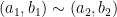
 (a_1, b_1) \sim (a_2, b_2) if and only if a_1\times b_2 = a_2\times b_1 
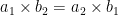
(the = sign represents standard equality). This makes sense because we can “cross-multiply” with fractions and preserve equality. Now that we have defined an equivalence relation, an example of an equivalence class for fractions would be all the fractions “equal” to (1, 2) such as (2, 4), (3, 6), (18,36), (510, 1020). These pairs of numbers are not really equal (we wouldn’t say (1,2) = (18, 36)) but with the correct equivalence relation defined, we can put them in the same equivalence class. Going into detail about the reflexivity, symmetry, and transitivity properties that any equivalence relation must have is a bit out of scope for this post, but I will give quick definitions here:

  • Reflexivity: a \sim a
  • Symmetry: if a \sim b then b \sim a
  • Transitivity: if a \sim b and b \sim c then a \sim c

If you would like, try to verify that our equivalence relation for fractions satisfies these three properties (it should be very easy to do).

Back to the Problem 🙂

Okay, now that we have some understanding of equivalence classes, we can solve the infinite case in a very similar manner to how we solved the 100 mathematician case.

What we want to do is reduce this infinite case to the finite case – which we know how to solve (we did it above). We can do this by dividing up the set of sequences of hat colors into equivalence classes using the following equivalence relation: two sequences are considered equal if they differ only at a finite number of positions. (If you would like, try to verify reflexivity, symmetry, transitivity on this equivalence relation). Now, the mathematicians must select a representative from each equivalence class. A representative is a single element from a particular equivalence class (any element). This element, by definition of equivalence classes, is “equal” to every other element in that equivalence class.

The set of hat sequences (in the case of infinite mathematicians) has infinite equivalence classes, each with infinite members, when equivalence is defined this way. To see why there are infinite equivalence classes, consider a sequence of all red. Then consider a sequence of alternating red and blue. Then consider a sequence that alternates 2 red and then 2 blue. Each of these could be a representative for a unique equivalence class, since it differs from the others in infinite positions. Continuing this pattern, we can generate infinite equivalence classes in this manner. To see why each equivalence class has infinite members, consider a representative sequence. Then consider a sequence that has the opposite color 1st hat but matches everywhere else. Then the sequence that has the opposite color 2nd hat (to the representative) but matches everywhere else. Since these sequences match the representative at all but 1 space (and 1 is finite) they are in the equivalence class of the representative. Continuing the pattern we can see that each equivalence class must have infinite elements.

In addition, every possible sequence of hat colors belongs to one and only one equivalence class. The transitivity of our equivalence relation ensures that a sequence cannot belong to more than one equivalence class. And if a sequence doesn’t belong to any existing equivalence class, we can make a new one for it (and all the infinite equivalent variants we just discussed above).

So in this new problem, the job of the mathematicians in their “conferral” period is to decide on a representative sequence from every equivalence class. A representative is just any element of the equivalence class, so in this case each representative is a particular infinite sequence of hat colors.

Once the mathematicians are arranged in a line, the first mathematician has to compare the sequence he sees with the set of representatives that were collectively decided on. Because of what we said earlier, the sequence of hat colors must fall into one and only one equivalence class. This means it differs from one (and only one) representative at a finite number of positions (it differs from the rest of the representatives at an infinite umber of positions). The first mathematician must figure out what this representative is and count the number of positions where the sequence differs from the representative. If this number is even, he’ll call out red (like before) and if it’s odd, he’ll call out blue. Every subsequent mathematician can now figure out their hat color using the same exact procedure as the finite case. However, instead of asking whether their hat is red or blue, they should ask whether their hat color differs from the representative sequence or not. From this (and from having collectively decided on a representative sequence beforehand), every mathematician except the first can guess their hat color correctly. Pretty cool!

Deaf Mathematicians and the Axiom of Choice

Now there is something weird about what we did in the first infinite case, which becomes clear when we consider another variant. In this variant, we also have an infinite line of mathematicians, but they’re all deaf. So no information is being carried forward when the mathematicians say their own hat color. Now, suppose the mathematicians create the set of representative sequences like we discussed they should do in the previous case. If they simply say the color that is at their position from the equivalent representative sequence, only a finite number of mathematicians will get their hat color wrong. This is because the sequence only differs from the representative at a finite number of positions (by our definition of equivalence).

So even in the case where each mathematician has no additional information from hearing the previous answers, they can guess their hat colors more accurately (only finite errors) than random guessing (almost definitely infinite errors). This doesn’t really make a lot of sense. No mathematician has any usable information about what their own hat color is, because no one who actually can see their hat has any mechanism of communicating with them. How can the mathematicians then do better than \frac{1}{2} getting the answer right?

The answer (or at least how the weirdness is introduced) is that implicit in our strategy for the mathematicians is the axiom of choice. The axiom of choice says something fairly simple: that for any non-empty set, we can choose one element from it. We need to make this assumption because our mathematicians need to collectively decide on a representative element from each equivalence class (set) of hat color sequences. The axiom of choice is key to our strategy in the infinite case. But this seems like a rather tame assumption – isn’t it obvious that if you have a box with things in it, you can reach in and grab one?

Credit: xkcd

However, the axiom of choice tends to create some mathematical strangeness – weirder things can happen than mathematicians knowing their hat colors a little too well. For example, there is the Banach-Tarski Paradox, which states that the 3D solid unit ball can be decomposed into a finite number of pieces and then put back together (using only translations and rotations in space) into two identical copies of the original ball.

Despite, this kind of paradoxical result, ZFC (with AC (axiom of choice) is still generally the paradigm of “choice” for set theorists. So if our infinite mathematician solution still seems a bit suspect to you, just replace the mathematicians with some modern-day set theorists and you should be alright.

A Variation on Bertrand’s Paradox (with Python simulation code)

Understanding the importance of a well-posed problem by examining a math problem with 3 different “correct” solutions.

A friend recently challenged me with this problem she found at a math competition:

It is actually quite a simple problem, that only requires some knowledge of the Pythagorean theorem, the challenge is recognizing that you have enough information to solve the problem even though you cannot compute the radius of either circle.

Just put in a right triangle, and call the radius of the smaller circle r and the radius of the larger circle R.

area = \pi R^2 - \pi r^2
4^2 + r^2 = R^2
16 = R^2 - r^2
16\pi = \pi R^2 - \pi r^2
area = 16\pi

Anyways, I was thinking about this problem as well as the Buffon’s needle problem, when I thought of this (seemingly simple) combination.

Suppose you have two concentric circles of known radii and you randomly choose a chord of the larger circle. What is the probability of the chord passing through the smaller circle?

The orange chords are those that intersect the center circle and the blue are those that do not.

I figured that this essentially the same as the Buffon’s needle problem (where you determine the probability that a needle crosses a set of parallel lines on the floor) and could be solved similarly using angles.

Since the circle has infinite rotational symmetry, we can choose one endpoint for our chord without loss of generality (as a point on the circle can be transformed into any other point via a rotation). Then, by randomly selecting the other endpoint, we can define a chord between the two points. If this chord is within \theta  
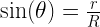
of horizontal, it will pass through the smaller circle. The total range of angles possible is 180 degrees and only chords passing through 2\theta  of this range pass through the center circle so probability = \frac{2\theta}{180} .

To get theta in terms of R and r (which is what we want our probability in terms of) we set up a right triangle:

\sin(\theta) = \frac{r}{R}
2\theta = 2\arcsin(\frac{r}{R})

So probability = \frac{2\arcsin(\frac{r}{R})}{180}

Let’s call this Method 1: Endpoint Method, because it relies on the selection of two random endpoints to define a random chord.

I thought this was quite elegant and showed it to my friend the next day at school. She, however, quickly thought of a simpler solution which seemed equally valid.

Instead of fixing one endpoint of the chord, she suggested giving it a fixed angle. Looking at one angle is representative just like choosing a particular endpoint, again because of rotational symmetry. So, for instance, we can look only at chords parallel to the y-axis.

This makes it clear that probability = \frac{r}{R}
We’ll call this Method 2: Radius Method because we choose a random radius for our chords to be perpendicular to.

At first, I thought these two solutions must be equal and that \frac{2\arcsin(\frac{r}{R})}{180} = \frac{r}{R} 
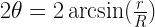
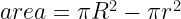
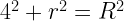
must be a mathematical identity. But if you plug in some numbers, say R = 15 and r = 3, you realize that these are most definitely not equal.

\frac{2\arcsin(\frac{3}{15})}{180} \approx 0.064 \neq \frac{3}{15} \approx 0.20

While trying to reconcile this, I came up with yet another method to solve the problem which yielded yet another answer!

This method utilizes the fact that a chord passes through the inner circle if and only if the chord’s midpoint is in the inner circle.

Also, except for chords with a midpoint in the exact center of the circle (randomly choosing the center has a probability of zero and can be ignored) any chord can be defined by its midpoint by drawing the radius passing through the midpoint and the chord as perpendicular.

So we  can generate random chords by selecting random midpoints and a chord will pass through the center circle if its midpoint is in the circle. Therefore, the probability of a chord passing through the center circle should be the ratios of the areas of the circles or $latex probability = \frac{r^2}{R^2} &s=2$.

We’ll call this Method 3: Midpoint Method, for fairly obvious reasons.

Someone pointed out to me that each of the three methods relied on a different way of randomly generating a chord:

Method 1: Specify two random points on the large circle’s perimeter. This can be done by randomly choosing two angles \theta_1  and \theta_2  between 0 and 360 degrees.

Method 2: Specify a random point on the large circle’s perimeter (to determine a radius) and a random length along that radius. This can be done by randomly choosing an angle \theta_1  from 0 to 360 degrees and a length L from 0 to R.

Method 3: Specify a random point within the large circle. This can be done by choosing a random x and y coordinate from -R to R and selecting again if (x,y) falls outside the circle.

Each method requires two randomly generated values to determine a chord, but what those values represent varies.

Still, its unclear why these differences should affect the probability. Each one of the three methods can generate every possible chord within the larger circle. And since there are infinite possible chords, the probability of generating any one specific chord is zero for all three methods (here’s an explanation). It seemed intuitive that this should mean that all three methods were equivalent.

When I searched this problem I found that it was essentially the equivalent of Bertrand’s paradox (named for its creator: Joseph Bertrand), which uses a circle and an inscribed equilateral triangle rather than concentric circles.

The resolution to Bertrand’s paradox is that our intuitions about the three methods being equal is incorrect. They actually generate three different probability distributions of chords in the circle. This is hard to imagine unless you can see it, so I wrote some code in Python to illustrate the disparate results of the three methods. (code included at end of post, in case you want to mess around with it)

Each of these images shows 100 random chords on a large circle with radius 15 units and calculates the theoretical (according to the disparate formulas) and actual (according to the simulation) probabilities that the chord passes through a smaller concentric circle of radius 3.

      These images show that even though all three methods can each generate every possible chord in the circle, they aren’t all the same. This is perhaps clearest from the chord distribution generated by the midpoint method, where there are few chords passing close to the center of the circle and many more closer to the edges of the large circle. The “paradox” is a result of unevenness between the distributions of the three methods.

So which of the three is the “correct” method?
In one sense, all three are correct. It merely depends on how the original problem defines “a randomly chosen chord”. The answer depends on whether the chord is selected by its endpoints, an angle, or its midpoint. The problem need to be more specific in order to be “well-posed” and possess a unique solution.

This is a fairly unsatisfying answer however, and it is possible to dive deeper. When we think of “random” we usually think uniformly distributed, meaning every outcome should occur with the same frequency. For example, a coin that lands on heads two out of three times has a skewed probability distribution while a fair coin has a uniform one. Either of these coins does land on heads some of the time and tails some of the time, but we prefer the fair coin.

So then we can ask, which of the three methods represents the “fair coin”?
This question actually has an answer: it has been proven to be Method 2: Radius Method. This is the method that represents throwing a stick onto a circle inscribed on the floor and it is the only possible method that generates a uniform distribution of chords on a circle. This means that no matter where you are in the circle (one can imagine sampling random unit squares) the same (on average) number of chords will pass through that area. The Radius Method was proven to be the only method that generates such a uniform distribution by Edwin Jaynes in his 1973 paper “The Well-Posed Problem”. Jayne’s proof gets quite involved but you can perhaps convince yourself that Method 2 is the correct method by seeing how it appears to produce a homogeneous shading of chords in the circle while methods 1 and 3 do not.

Python Simulation Code:
If you are a novice to programming/Python, all you need to run this code is to download Anaconda with Python and all the packages you need will already be installed (matplotlib and scipy specifically).

Code Link

Inside Out Universe – The (Legitimate) Hollow Earth Theory

Using projective geometry to invert the world as we know it.

The universe seems like a dauntingly large place. Our minds can barely comprehend distances between bodies within our own solar system – such as the 93 million miles separating the Earth and the sun – let alone the vast spaces between galaxies. Even when we use the fastest possible motion in the entire universe (the speed of light) to quantify these distances, they remain staggeringly large: it’s 2.5 million light-years to our next-door neighbor, the Andromeda Galaxy. And our Milky Way galaxy and the ones nearby are just the beginning…

Astronomers using the Hubble Space Telescope have captured the most comprehensive picture ever assembled of the evolving Universe — and one of the most colourful. The study is called the Ultraviolet Coverage of the Hubble Ultra Deep Field (UVUDF) project.

Images like this one from the Hubble Space Telescope are extremely popular because they illustrate the sheer vastness of the universe. Thousands of galaxies pepper just this one image, each one consisting of millions of solar systems, stars, and planets. Just look at this photoseries which zooms out from Earth until the observable universe is in view. Carl Sagan’s famous “pale blue dot” quote doesn’t just describe Earth, at the right scale it describes our solar system, our galaxy, and even our local supercluster. It’s hard not to feel insignificantly small on such an unimaginably large backdrop.

So imagine how surprised I was when I learned of a theory that the universe could be contained in a sphere the size of the Earth. It posits that the Earth is hollow and we live on the inside (along the perimeter) and all celestial bodies are contained within Earth’s roughly 8,000 mile diameter.

This seems utterly deranged at first; not even on par with flat-Earthers or conspiracy theories claiming the Earth is hollow and filled with secret “inner-Earth” societies. There are dozens of experiments that prove that the Earth is a rotating sphere hurtling through space, including Foucault’s pendulum and Eratosthenes’ shadow experiments. For that matter, when we look up its not like we see people from across the world looking back down at us!

However, this theory can be backed up mathematically and in fact living in this “nutshell Earth” (a term coined by Martin Gardner when examining and ultimately rejecting the theory) is indistinguishable from our current hypothesis of the structure of the universe (the Copernican model).

How can this be? Well, there exists a method for mapping all points on a plane into points in a circle of fixed radius. This is called inverting the circle. It works as follows:

  • Select a point P outside the circle
  • Draw a straight line between P and the center of the circle O
  • Find M, the midpoint of the line between P and O
  • Draw another circle with center M and going through P
  • Draw a straight line between N and N’, the points where the two circles intersect
  • P is where OP and NN intersect

In this manner, any point outside the plane maps to one and only one point within the circle. Reversing the process means that every point in the circle (except the exact center of the circle) maps to one and only one point outside the circle. The further away the original point is from the circle’s edge, the closer its inverse will be to the center of the circle. Only a point infinitely far away from the circle will map to the circle’s exact center.

If you want to mess with this a bit more and get a better idea of what circle inversion actually does, this applet allows you to see what your drawings look like after being inverted into a circle.

Essentially the same process of inversion can be generalized into three dimensions to map any point in a volume to a point within a fixed radius sphere. So if we imagine the Earth to be hollow and the universe to surround it, we can apply this perspective transformation to place every object in the observable universe within the hollow sphere. The heavenly bodies become miniscule, but each and every one can coexist in our nutshell Earth.

So there is a mathematical method for transforming all the universe into a sphere the size of the Earth without losing any information (as the transformation can be applied in reverse to regain the much larger Copernican model). The Earth’s surface maps to itself (with us living on the inside surface of the hollow sphere) and all of outer space becomes embedded within, with the farthest galaxies closest to the origin point of the sphere. The Egyptian mathematician Mostafa A. Abdelkader, the most sophisticated defender of the nutshell Earth theory, described such an inversion in his article “A Geocosmos: Mapping Outer Space Into a Hollow Earth” published in 1983.

After inversion, the moon, our closest celestial neighbor, maps to a sphere 955 meters across that circulates around the Earth’s axis from 6265 kilometers above Earth’s surface (all these observations are are from a perspective outside the nutshell and therefore outside the universe). The sun shrinks to about 2.5 meters across and recedes to a location a mere 253 meters from the origin point (which is the center of the universe). Pluto shrinks to the size of a single bacterium orbiting seven meters from the origin, while Alpha Centauri, the star closest to our own Sun, becomes an infinitesimally small speck situated a mere millimeter from the origin. Every other star and object in the cosmos, therefore, is contained in a sphere less than two millimeters across that hovers 6371 kilometers above our heads.

But even if you can accept this strange idea, what about the phenomena we observe that demonstrate the Earth’s movement through space? To give a fairly prominent example, how does this theory explain the daily sunrise and sunset?

Well, this is where it gets interesting. For a nutshell Earth to mesh with observed phenomena, the laws of physics must also be inverted. The behavior of gravitational, electromagnetic, and light waves is distorted to create a new, consistent “inverted physics” that explains the observations that conventionally lead us to a Copernican universe in a nutshell Earth.

The changed behavior of light rays are perhaps the most striking feature of the new model. In the Copernican cosmos, rays of light travel in straight lines. The position of the sun in relation to the observer determines what they will see. In the figure, an observer stationed under ray C will be experiencing solar noon while an observer stationed under ray A will be watching a sunset. As the Earth rotates on a 24 hour cycle, people on Earth experience the change from day to night.

So the sun moving across the sky is a point in favor of the Copernican model, right? Actually, no. The inverse mapping preserves angular relationships, so that observers positioned in the nutshell Earth would experience exactly the same phenomena as those in a Copernican universe.

Angular relationships are preserved during circle inversion: the angles in the triangle are the same as those in the inverted triangle

In the nutshell Earth, light rays can follow curved paths according to the inverted laws of physics. A maps into as ray a, and an observer positioned at ray h’s intersection point would observe the sun on the horizon. Because the Sun rotates around the origin, O, the observer would see it as setting, exactly as does the observer in the Copernican cosmos. Just as in the previous figure (representing the Copernican model), an observer intercepting ray would be experiencing solar noon and a person observing b would see the sun as being somewhere between the horizon and the solar zenith.

Rays D and E do not intersect Earth in the Copernican universe and, assuming they do not intersect anything else, will continue traveling to infinity. In the nutshell Earth, however, d and e travel in arcs that lead back to the origin. The rays never actually reach the origin, however, because the inversion operation affects not only the direction of light rays, but their velocities as well. The speed of light is constant in the Copernican universe, but variable in the nutshell Earth, ranging from 3 * 10^8 meters per second at the perimeter to zero meters per second at O.

The result of these conditions is that all observations and estimates of the size, direction and distance of any celestial object would lead to exactly the same result for an observer on the outside of Earth in a Copernican universe and his image observer inside the nutshell Earth, no matter where they are with respect to Earth’s surface.

Even the iconic “Earthrise” picture taken from the Apollo 8 manned mission to the Moon, which appears to so convincingly show a spherical Earth floating in a vast empty space, can be explained in the nutshell Earth theory. The curved light rays emanating from the sun illuminate half the Earth (creating the night/day cycle as the Sun revolves around the origin). Many of the curved light rays from the Moon are lost in the night of the center of the hollow Earth and only a portion of the Earth is visible.

Similarly, other phenomena such as the movement of Foucault pendulums are accounted for by other inverted laws of physics. explained conventionally as effects arising from Earth’s rotation about its axis. The direct isomorphism between the Copernican universe and the nutshell Earth means that its is impossible to refute it as a valid model based on empirical tests. Every possible observation made in a Copernican universe has its exact analogue in the nutshell Earth. This also means that it is impossible to prove the nutshell Earth theory. Evidence such as the Tamarack Mines plumb lines which is commonly used by conspiracy theorists to “prove” the surface of the Earth is concave don’t apply to the nutshell Earth theory because they don’t mesh with its inverted laws of physics.

So if we can’t prove or disprove the nutshell Earth theory, what exactly is it? Well, it’s really more of a thought experiment. We rarely look at the assumptions we make when describing the structure of the universe. Our observations match the Copernican idea of the universe, given we accept the untestable (though understandable) assumption that light always propagates in straight lines. But if we make a different set of untestable assumptions? We end up with the nutshell Earth.

I mentioned before that prominent physicist Martin Gardner rejected the nutshell Earth theory. He did this on the basis of Occam’s Razor – which holds that when given two choices with the same explanatory and predictive power, we should adopt the simpler one. Increased complexity is acceptable only when it yields a better theory in terms of explaining or predicting observations. For example, Einstein’s relativity added complexity to Newtonian physics but it also allowed us to explain certain natural phenomena, like small deviations in the orbit of Mars. The nutshell Earth requires significantly more mathematical complexity (see below) and exchange we get only the security blanket of believing that our little planet is important in the vast scheme of things.

A significant increase in mathematical complexity results if we move to this inverted model of the universe.

And even this security blanket is rather thin and possibly nonexistent. Gardner points out that the nutshell Earth model of the universe doesn’t require a nutshell Earth, it’s just as likely to be a nutshell Moon or Mars or Sun or Planet X. There are an estimated 10^{10} galaxies in the known universe. Assuming that each of these contains 10^{11}, as does our own galaxy, and that each of these stars is orbited by a mere ten other objects (planets, their moons, comets, asteroids, and small bits of rock or ice—any semi-spherical body will do), there are approximately 10^{22} objects in the universe to choose from. The probability that any one of them, including Earth, is the preferred body is only \frac{1}{10^{22}}, which is vanishingly close to zero. Moreover, there is no reason why the inversion must be done in relation to a physical body at all. It is equally plausible to simply perform the inversion around an arbitrarily chosen spherical region of space, in which case the choice of regions and spheres is limitless. Regardless of which sphere we choose, if it is anything other than Earth, our planet becomes even smaller and less significant than ever after performing the necessary perspective transformation. We would be a minuscule speck, probably less than a fraction of a millimeter wide, floating near the center of some hollow celestial body.

So if the justification for selecting a nutshell Earth is only an artifact of our human tendency towards geocentrism, why not take it even further towards egocentricism and map the universe to your own mind? Inverting the universe with respect to your brain means that your skull contains every star, galaxy, asteroid, and speck of dust in the cosmos. That has got to relieve some of those feelings of cosmic insignificance. Feel content in the knowledge that it is empirically impossible to disprove the theory that you completely contain the universe. Lest others think you’re a bit crazy, I would suggest storing this knowledge safely along with the rest of the universe: in your own hollow nutshell of a mind.

Buffon’s Needles and Noodles

A probability exercise leads to an exploration of circles and other shapes of constant width.

Here’s a fun little probability exercise, called Buffon’s Needle: Take a needle of length one unit, and drop it onto a field of parallel lines spaced one unit apart from each other. What is the probability that the needle crosses one of the lines?

Imagine someone dropping a needle on its end. In a perfect world (the one we live in for most math and physics problems) one end of the needle hits the ground first (so it is balancing on its tip) and then the needle falls in a random direction.

We can simplify the problem a bit using symmetry. We can assume the needle falls to the right, eliminating half the possibilities. Also, the y-coordinate of the point does not matter because the board is the same along the y-axis, so we only need to look at the x-coordinate of the point. We can describe this by measuring distance from the closest line on the right which is some number between 0 and 1 which we will call d.

Now we have to determine the range of angles that the needle can fall towards and still intersect the line on the right. A graphic makes the right triangle that we need to use to solve the problem easier to see.

\cos(\theta) = x
\theta = \arccos(x)

2\theta is the size of the angle in which the needle can fall and intersect the line, and the total angle is 180 degrees or \pi radians. The probability of crossing the line for each value of x is therefore \frac{2\arccos(x)}{\pi} . Since we need to add these probabilities for each possible value of x, we integrate this function from 0 to 1.

\int_{0}^{1}\frac{2\arccos(x)}{\pi}

We can use the integral of \arccos(x), see proof here.

\int\arccos(x) = x \arccos(x) + \sqrt{1 - x^2} + c

Then with some very basic arithmetic (which I leave to the reader because it’s fairly unimportant), we find that

\frac{2\arccos(x)}{\pi} = \frac{2}{\pi}

So the probability that a needle of length one will intersect one of the lines is \frac{2}{\pi} or about 0.64.

This property is commonly used as a neat demonstration to approximate \pi. Simply drop some needles (or other straight object, angel-hair pasta is a common choice) onto a field of evenly spaced lines and set the probability you get experimentally equal to \frac{2}{\pi}. If you would like to do this demonstration online, you can try here.

It tends to surprise students because we are only dealing with straight lines and straight needles, and \pi, usually associated with circles, shows up. However, doing the math makes it quite clear where the trigonometry comes in; it’s a result of the 360 degree angle the needle can fall in after touching the field.

The problem doesn’t need to have a needle of length 1. Once we get into longer lines, more than one intersection becomes possible and even probable, so we should stop talking about probability and start calling it “expected number of intersections”. Expected value is always additive so it grows linearly with length. So we can take dropping a needle of length 2 as having the same expected value as dropping 2 needles of length 1. Curves can be thought of as very short straight line segments arranged end to end, so we can use the same idea to determine the expected number of intersections for a curve. When you are working with curves, the problem in renamed Buffon’s noodle, but doesn’t change much outside of that.
The formula that becomes of interest therefore is: “expected intersections” =  \frac{2}{\pi} \times l where l is the length of the line or curve.

I got curious as to what would be the length of a curve that had exactly 1 or 2 expected intersections would be and quickly found that it would be \frac{\pi}{2} and \pi. That second value isn’t surprising at all because it is the perimeter of a circle of diameter 1, which is guaranteed to intersect the field of parallel lines exactly twice.

Side note: is there a curve that guarantees exactly one intersection? (I don’t think there is, but I’m not positive) If not, is there a specific curve that gives the highest probability of exactly 1 intersection? (My guess is a straight line).

Initially, I thought that this might be a cool way to prove that a circle is the only constant-width shape, as any shape that would always intersect the field exactly twice would have to be a constant-width shape of width 1, and a circle was the only example I could think of. But when I looked it up, I saw that all I proved was that a constant-width shape of width 1 has to have a perimeter of \pi. There actually are constant-width shapes other than a circle. They are called Reuleaux polygons, and their boundaries are formed by  taking a polygon with an odd number of sides, centering a circle at each vertex, and using these to round off the sides.

For example, here’s a Reulaux triangle and pentagon (the shape itself is in red):

We can do this with any polygon with an odd number of sides (and make some pretty pictures too). Here’s a Reuleaux heptagon and nonagon:

These are constant-width shapes, meaning they roll. For a more mathematical definition, every pair of parallel supporting lines (lines of the same slope that touch the perimeter of the shape) have the same Euclidean distance from each other regardless of orientation.

Curves of constant width have many applications. They are surprisingly relevant to that old job interview question: Why are manhole covers round? Well, it’s because a circular manhole cover has constant width and therefore cannot fall into the sewer whereas a square one could be turned diagonally and accidentally dropped down there. A Reuleaux polygon would also serve for this purpose.

Constant width is what enables circles to roll, so they can be used as wheels. So why don’t you see Reuleaux polygons being used as wheels? For most applications (such as cars and bikes), wheels need axles to turn around. In a Reuleaux polygon, the center point is not fixed as the object rolls but rather moves along a small circle within the shape. The movable axle required is quite the engineering challenge, and therefore impractical for most applications. However, ball bearings could theoretically be made by machining Reuleaux triangles instead of circles, and there would be no problem because no axle is required. It would even save a little metal because a Reuleaux triangle of width 1 has an area of about 0.705 as compared to a unit circle, which has an area of 0.785.

This gif shows the rotation of the central point of the Reuleaux triangle:

This is quite the fun little problem and there is a ton more you can do with it mathematically than the usual approximating \pi which is rather cool in itself. How does the probability change if the lines are spaced further apart? If you have a grid rather than parallel lines? What about if you wanted to know the probability of having one intersection or two, or three, rather than the total expected value? How does that depend on the shape of the curve? Lots to explore here, even starting with the simple premise of needles and noodles.

Spatial Reasoning Brainteaser

A simple puzzle involving engineering drawings.

In chemistry, we’re learning about molecular geometry which is a subject that takes a bit of visualization to understand. My teacher mentioned that girls tend to have poorer spatial reasoning skills, maybe because we are less likely to play with blocks and other similar toys as children. (He was probably citing this study). A few of the boys in my class were getting a little too cocky so I gave them this tough orthogonal projection problem to think about. After that they definitely realized that a slight tendency one way or another doesn’t mean much for individual cases or skill levels.

Anyways, just a fun little problem that tests your sense of spatial reasoning. Usually people think about it for a wile, get stuck, declare that it’s impossible, then figure it out in a flash of insight.

The goal is to draw the 3-dimensional (isometric) shape that matches the orthogonal projections:

First, an example.

Orthogonal Projections:

Isometric Solution:

Hopefully you were able to understand the drawings and figure out the solution!
Now for the tricky problem:

And before you feel too clever for having thought (like I did) of this:

Know that for the purposes of this problem, holes in the figure are represented in the engineering drawings by dotted lines. So the top and side views for the above would be:

Since there are no dotted lines in the initial two drawings, this is not the correct solution.

Think about it for a while and then, once you think you’ve solved it, scroll down for the answer. Remember, only one side view is provided so not every side has to look the same.

.

.

.

.

.

.

.

.

.

.

Solution(s):


These are the two (similar) solutions that I have found (if you find another feel free to email me and I’ll update this post). The real jump most people have to make in finding the solution is to get away from thinking of the object as a cube. Once they realize that a slanted surface can serve as both a top and side view, they typically stumble on the solution pretty quick.


Error and Multiple Measurements

Mathematically quantifying error a.k.a. being right about how wrong you are.

Recently in Physics Club, we have been preparing for the first test in the Physics Olympiad series, the    F = ma contest. The majority of the problems can be solved using basic equations of motion, but occasionally a problem comes up that requires some intuition. And these “intuitive” problems can be much trickier to solve mathematically than they appear to be.

A perfect example is Problem 25 on the 2016 F = ma contest which can be simplified down to this:
Christina measures a 1.5 meter piece of string with a meter stick, making two measurements which each have an error of  \pm 0.1
Alice measures the same 1.5 meter length of string with a 2 meter stick, making one measurement which has an error of  \pm 0.2

Who makes the more accurate measurement?

Initially, the group came to a consensus that the two measurements are equally good because they both have the same maximum error of \pm 0.2 and an expected error of 0 (because the positive and negative error cancels out). But then somebody brought up the point that Christina’s measurements could “cancel out” if one was positive and the other was negative. Christina’s two measurements can combine to have zero error in multiple ways (for example, an error of +0.05 and then -0.05) while Alice’s measurement can only be error-free if he randomly gets that exact value. So Christina’s measurement must be better than Alice’s. This is actually the correct answer but this line of reasoning isn’t particularly helpful for figuring out specifics. How much better is Christina’s measurement? What if each of her measurements had an error of 0.175? How would having a normally distributed range of errors (rather than randomly distributed) affect the results? To answer these questions we need a mathematical solution to the problem.

First, we have to determine a mathematical definition of accuracy. Since we are dealing with probability, accuracy should be some sort of expected value. However, the expected value for the error doesn’t help us: it is zero for both cases. Instead, we have to take the absolute value of the error and calculate the expected value of that. Now we can simplify this problem down even further.

Randomly pick a number  n randomly such that  -1 \leq n \leq 1 (I’m using 1 instead of 0.1 because I prefer to work with whole numbers and it doesn’t really make a difference)
Randomly pick another number m with the same constraints.
Calculate the expected value of \mid n + m \mid and compare to the expected value of \mid p \mid where p is randomly chosen such that  -2 \leq p \leq 2

It is easy to see that the expected value of \mid p \mid where p is randomly chosen such that  -2 \leq p \leq 2 is 1. Since  p has an even probability distribution, all we need to show is that \mid p \mid has an average value of 1. This is pretty clear from a graph of p vs. \mid p \mid or  \int_{-2}^{2} \mid p \mid dp = 1.

Finding the expected value of \mid n + m \mid is quite a bit trickier, especially when you realize that \mid n + m \mid \neq \mid n \mid + \mid m \mid . We can apply the same process we used above but we have to graph in 3 dimensions because we now have an additional variable. Put n on the x axis, m on the z-axis, and the error on the y-axis. The function \mid n + m \mid now defines a plane that looks something like this:

The area under this plane can be calculated by finding the volume of 2 right tetrahedrons using the volume of a right tetrahedron formula ( \frac{abc}{6} where a, b, and c are the lengths of the sides that from the right angle).

So:

 v = \frac{(2)(2)(2)}{6}
2v = 8/3
 expected\:value = \frac{8}{3} /4 (4 is the area of the base of the cube)
 expected\:value = \frac{2}{3}

So the average error in Christina’s measurement is 0.0667 compared to Alice’s average error of 0.1! Each of Christina’s measurements could be up to 0.15 off, and her measurement would be equal to or better than Alice’s in terms of accuracy. You can do the same thing to determine expected error if each of Christina’s measurements had a different error (for example, if her first measurement was accurate within \pm 0.125 while her second was only accurate to within \pm 0.175) by drawing distorted tetrahedrons and calculating their volumes. But what if Christina took 3 measurements? Or 10? There is no way we can imagine and calculate volumes in 11 dimensional space. To do this problem, we have to recognize that what we just did above was calculate a double integral.
Namely:

\frac{1}{4} \int_{-1}^{1}\int_{-1}^{1} \mid n + m \mid dn \: dm = \frac{2}{3}

If we want to do the same thing for 3 measurements (each accurate to within  \pm 1 , we would simply take the triple integral. The number in front would change to  \frac{1}{8} as well. Why? Because that number represents the probability distribution function for the individual errors. When there was just one randomly selected variable such that  -2 \leq p \leq 2 , it was  \frac{1}{4} since the distribution function of p looked like a horizontal line through (0,  \frac{1}{4} because every  p had the same chance of being chosen. When there were two variables, the coefficient was still  \frac{1}{4} because the distribution functions of both n and m were a horizontal line through (0,  \frac{1}{2} ) and  \frac{1}{2} \times \frac{1}{2} = \frac{1}{4} . This also answers the question of what happens when the probability distribution of the error is a normal distribution, you just plug the Gaussian into your integral before calculating. The calculus gets quite messy at that point, however, so I’m not going to do an example.

Basically, for some arbitrary number of measurements  n where  \varphi(x) is the probability distribution function for x, we get:

 \int_{-1}^{1} \dots \int_{-1}^{1} \varphi(x_1)\varphi(x_2)\dots \varphi(x_n)\:\times\mid x_1 + x_2 + \dots + x_n \mid dx_1 dx_2 \dots dx_n

But to do the original problem we didn’t need calculus at all, we just needed (interestingly enough) tetrahedrons and an understanding of probability.